Willkommen und Abschied – Theaterplakat
Welcome And Farewell – Theatre Poster
Welcome And Farewell – Theatre Poster
Das Projekt begann mit einem Moodboard zum Thema "Zeit".
The project startet with a moodboard on "time".
The project startet with a moodboard on "time".


Es folgte die Ideensammlung in Form eines Skizzenbuchs.
It followed the collection of ideas with a sketchbook.
It followed the collection of ideas with a sketchbook.


Time hurts. Like a big black ball. Like a big bomb bursting your body inside.

Ticking away the moments that make up a dull day You fritter and waste the hours in an offhand way.Kicking around on a piece of ground in your home town Waiting for someone or something to show you the way.
Tired of lying in the sunshine staying home to watch the rain. You are young and life is long and there is time to kill today. And then one day you find ten years have got behind you. No one told you when to run, you missed the starting gun.
(Pink Floyd – Time)
(Pink Floyd – Time)


Und kommt die Zeit…
And comes the time…
And comes the time…

…so geht der Moment…
…there it goes the moment…
…there it goes the moment…

…verblasst mehr und mehr…
…is fading more and more…
…is fading more and more…

…bis schließich…
…til finally…

…nichts mehr übrig ist.
…nothing is left anymore.
…nothing is left anymore.

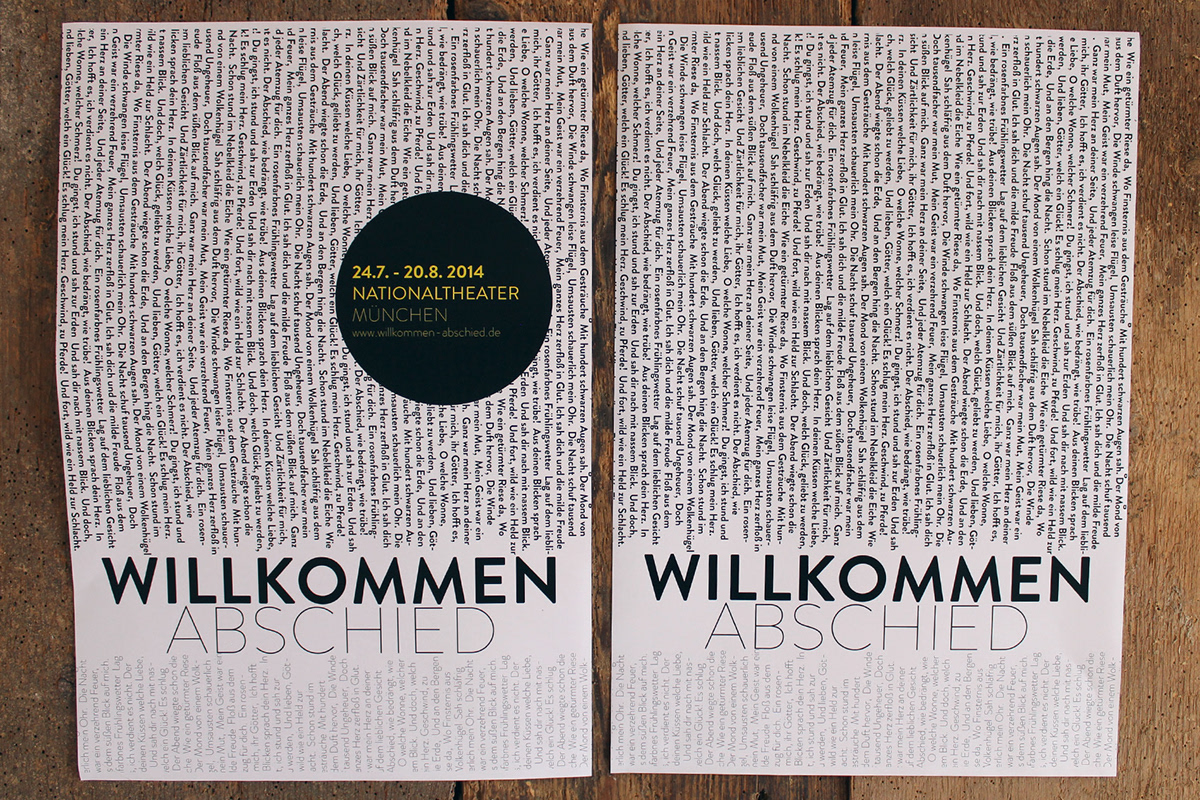
Es entstand ein Plakat mit Buttonaufkleber. Zunächst soll das Plakat für sich alleine stehen und den Betrachter ermutigen sich genauer damit auseinanderzusetzen. Drei Monate vor Spielbeginn werden die Plakate druch Button Aufkleber ergänzt, welche die wichtigen Informationen liefern und den Betrachter schließlich aufklären.
Mit der ausschließlichen Verwendung von Typografie wird dem Betrachter das Stück näher gebracht. Das gilt sowohl inhaltlich, weil der Name des Gedichts/Stücks im Zentrum steht und das Gedicht selbst in Wiederholung den Hintergrund bildet. Aber auch formal spiegelt die Typografie die Thematik wieder. Der Textverlauf, der von oben nach unten immer heller wird, kommt angerollt wie das Kommen und Gehen von Zeit. Wobei das freudige Erlebnis von "Willkommen" das stärkere, standhaftere und unerschütterlichere Element bildet, das dem schwachen, zerbrechlichen und verblassenden "Abschied" gegenübersteht. Dabei liegen die beiden Wörter formal und inhaltlich nur um haaresbreite voneinander entfernt.
A poster with a button sticker developed. First of all the poster should act without the sticker, it should motivate the observer to watch the poster more detailed and interested. Three month before the play is starting the sticker will be added, it gives the important and explaining informations. The poster shows the play by just using typography. This is in force of both content and form. Like this you can see the name of the play in the center and a repetition of the poem itself in the background. The formal mirror of the content is the text gradient, which is getting lighter from top down like the coming and going of time. Thereby the happy experience of "welcome" is the more powerful, heavy and immovable word in contrast to the weak, fragil and fading "Farewell". At the same time both words are by a hair short of each other.

Ein Motiv, drei Plakate. Die alternative Plakatidee zeigt ein Motiv das im Verlauf von Version 1 zu Version 3 immer mehr verblasst bis es schließlich nicht mehr erkennbar ist. Das Verblassen ist gleichzusetzen mit der Vergänglichkeit, Erinnerung und dem Abstraktum Zeit. Das Motiv zeigt eine Frau, die scheinbar ins Leere blickend jegliche Gegenwärtigkeit verloren hat. Sie ist anonym und allegorisch für die Zeit selbst.
One motive, three posters. The alternative poster idea shows one motive, that fades from version 1 to version 2 more and more until almost nothing is left. The fade is equatable to fugacity, memory and the abstract of time. The motive shows a woman, which apparently watchs into the emptiness by loosing every presence. She is anonym and is allegoric for time itself.
One motive, three posters. The alternative poster idea shows one motive, that fades from version 1 to version 2 more and more until almost nothing is left. The fade is equatable to fugacity, memory and the abstract of time. The motive shows a woman, which apparently watchs into the emptiness by loosing every presence. She is anonym and is allegoric for time itself.


